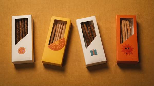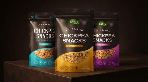
That bag of chips isn't just holding your snack—it's making a pitch. Color choices, cartoon characters, and emotional framing are deliberately engineered to shape what you expect a snack to taste like, how healthy you believe it is, and how badly you want it. Peer-reviewed research and industry analysis show these cues work on us before we take a single bite.
The Psychology Behind Snack Packaging: An Overview
Here's the humbling truth of the modern supermarket: your snack has roughly five seconds to sell itself. As industry reporter Gill Hyslop notes for BakeryAndSnacks, a product may take eighteen months to formulate and survive countless factory trials, but the shopper standing in front of it knows none of that. They're scanning a crowded shelf and deciding, almost instantly, whether the pack deserves their attention.
That speed matters because of how our brains process shopping decisions. Research applying the Elaboration Likelihood Model—a well-established framework describing how deeply people process persuasive information—to snack packaging found that consumers frequently rely on low-level cognitive processing, using superficial cues like color to form attitudes about healthiness and tastiness. In other words, when attention is scarce, the packaging is the product, at least until the first bite confirms or betrays the promise.
Color Cues: Shaping Perceptions of Taste and Health
Color is the fastest lever a designer can pull, and the research maps it precisely. According to the study on packaging color and purchasing decisions published in the Asian Journal of Business Research, green and blue hues are linked to perceptions of healthiness, while red and yellow evoke tastiness. Those associations aren't decorative accidents—they feed directly into what researchers call a health halo, where a single cue (a green band, a leaf motif) colors our judgment of the whole product.
The strategic implication is straightforward: a manufacturer aiming at health-conscious shoppers can reach for blue and green palettes, while a brand selling indulgence leans warm and vivid. The study's authors suggest marketers can deploy these colors strategically to influence consumer decisions, particularly across different eating behaviors. The catch for consumers is that the color signals a perception of health or taste, not the verified reality—your brain fills in the rest.
Imagery and Character Marketing: Appealing to Desire
Nowhere is packaging psychology more vivid—or more studied—than in its effect on children. A 2015 study published in Frontiers in Psychology, led by Laura Enax and Bernd Weber with a research team spanning the University Hospital Bonn and other German institutions, tested packaging cues on 179 elementary school children. Each child rated three objectively identical yogurt-cereal-fruit snacks presented with different labels: a plain version, one emphasizing health aspects, and one that additionally featured unknown cartoon characters.
The result: the packaging cues measurably shifted how the same food tasted to the children and how hard they were willing to work for it. The researchers also introduced a clever measure of desire—handgrip strength—to gauge effort provision for the snack. A separate qualitative study conducted in Guatemala, indexed on PubMed, reinforces the point from another angle: it identifies food packaging as one of the most important marketing tools for persuading consumers at the point-of-sale, and food marketing more broadly as a recognized risk factor for childhood obesity. Characters and bright imagery aren't there for fun; they're there to move product.
Emotional Appeal: Connecting Beyond the Product
Beyond specific cues lies a broader design philosophy: emotional appeal. In a paper on snack packaging design from Tianjin Polytechnic University, authors Liu Liying and Song Kuiyou argue that excellent packaging functions as a link between product information and consumers' purchasing desire, and that what best resonates with purchasing behavior is consuming psychology—the consumer's emotional appeal.
Their framing is almost blunt about the craft involved. They invoke the principle of keeping the consumer's aspirations in mind, arguing it is critical for the packaging designer to conduct deep research into consumers' emotional appeal before carrying out product design. In practice, this means designers weigh psychological, physical, and market factors together, treating the product's external and internal features in an artistic form to attract consumer attention. The goal isn't just to describe the snack—it's to make you feel something that the snack itself then seems to promise.
Common Psychological Tactics in Snack Packaging
The table below distills the research into a deconstruction framework. Pick up any snack package and run it through these categories to identify what each design element is trying to make you believe.
| Packaging Tactic | Psychological Principle | Intended Consumer Perception | Evidence Base |
|---|---|---|---|
| Color choice (green, blue) | Health halo; peripheral-cue processing under low attention | "This is a healthy choice" | Asian Journal of Business Research study linking green/blue to perceived healthiness |
| Color choice (red, yellow) | Color-association priming of tastiness | "This is delicious and indulgent" | Same study; red and yellow evoke tastiness perceptions |
| Cartoon characters and "fun" labels | Cue-driven taste expectation and effort provision | "This is fun and I want it" | Frontiers in Psychology study of 179 children rating identical snacks with different labels |
| Emotional framing (nostalgia, aspiration, comfort) | Emotional appeal as the link between information and desire | Personal connection that precedes the purchase | Tianjin Polytechnic University design analysis urging pre-design research into consumer emotions |
| Overall shape and design cues | Sensory expectation setting before consumption | Anticipation of crunch, flavor, and quality | BakeryAndSnacks industry reporting on design cues creating sensory expectations |
Two boundaries are worth stating plainly. These examples come from published research and illustrate documented principles—they are not an exhaustive catalog of every tactic on the shelf. And this framework describes how design intends to influence perception; it does not evaluate any specific brand's packaging or offer medical and nutritional advice about what you should actually eat.
Empowering Your Snack Choices
Consumers can make more conscious snack purchasing decisions by actively identifying and understanding the psychological tactics embedded in packaging design. The next time you're standing at the shelf, pause on the color palette, the characters, and the emotional tone before you reach for the bag: ask what perception each element is engineered to produce, and whether the nutrition panel matches the story the package is telling. A useful measurable indicator of success is the ability to articulate at least two specific psychological tactics you observe on a snack package and their intended influence on your perception. When you can name the green health halo and the cartoon character working on your expectations, the package loses much of its five-second advantage.