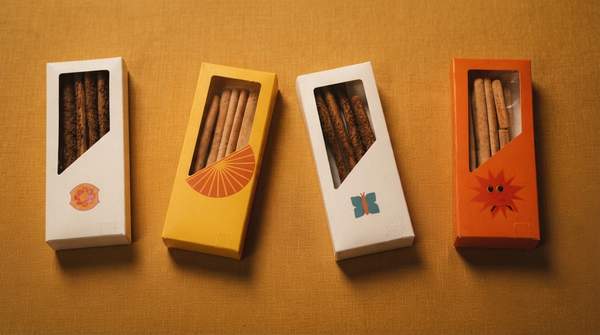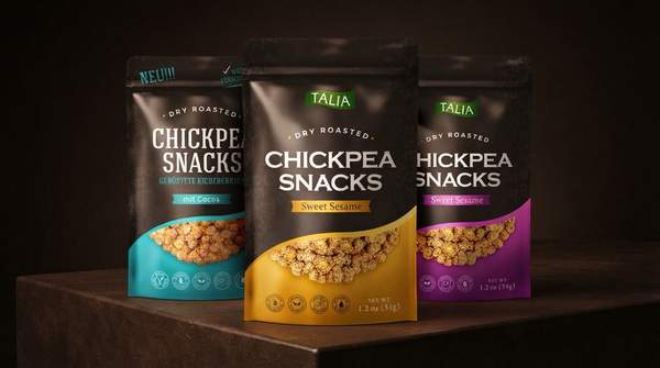
Snack packaging does most of its selling before anyone tastes anything. Within roughly five seconds of a shopper encountering a pack, its color, typography, imagery, and materials have already formed expectations about taste, healthiness, and quality—often subconsciously, and often before a purchase decision is even consciously made. That is the practical stakes of packaging design: it is not decoration wrapped around preservation, but a fast, silent salesperson whose individual elements can be chosen deliberately to signal luxury, health, playfulness, or value. This article breaks those elements down and assembles them into a decision framework you can use to evaluate or design a snack pack.
The Critical First Impression: Understanding the 'First Moment of Truth'
The retail industry calls the instant a shopper first confronts a product on the shelf the "First Moment of Truth," and for snacks it is brutally short. Reporting by Gill Hyslop at BakeryAndSnacks frames the window bluntly: your snack has five seconds to sell itself. Faced with competing packs, consumers form expectations around taste, healthiness, and quality from packaging cues before they have tried either product—and packaging can start shaping how they expect the snack to taste before they have even opened it.
What makes this window so consequential is that the judgments are largely subconscious. Writing on packaging psychology, Andrina Rose of SupremeX notes that in the split second it takes for a consumer to encounter a product on a shelf or in an online store, design elements such as color, imagery, and typography evoke emotions, convey brand personality, and communicate key messages—all within a fraction of a second. CANPACK's analysis of packaging and consumer choice adds a commercial kicker: packaging can influence purchasing decisions even for consumers with no intention of making a purchase, and many consumers will try something new solely because the packaging caught their eye. The design details in the sections that follow matter precisely because they all have to land inside this compressed window.
Color Psychology: Shaping Perceptions of Taste, Quality, and Health
Color is the fastest-reading element on the pack, and it splits snack brands into two broad visual dialects. Luxury snack brands tend toward muted, sophisticated colors—gold, black, deep blue, and earthy tones—chosen to evoke feelings of exclusivity and elegance, according to a University of Washington-hosted visual culture analysis of snack packaging psychology. At the other end, vibrant colors like red and yellow evoke excitement and energy, which is why they suit products aimed at impulse buyers or children; the same analysis notes that humans gravitate toward color because it strikes emotion in us, whether happiness in yellow or anger in red.
Between those poles sits a health-signaling palette. Muted tones and earthy colors convey naturalness, health, or sophistication, attracting health-conscious or premium consumers—color choices that align with perceptions of quality and specific lifestyle values, as packaging-psychology guidance from the Bigeye agency puts it. The strategic point is that no color is universally "good": red can trigger impulse energy or, in a different context, alarm; earthy brown can read as wholesome or as drab. The right choice depends on which perception—indulgence, health, or fun—the brand needs the shopper to form in those first five seconds.
Typography and Imagery: Communicating Brand Personality and Product Attributes
Typography is the pack's voice, and font choice alone can position a snack up or down the price ladder. Elegant or script fonts suggest luxury or tradition, enhancing a product's perceived prestige and communicating a sophisticated brand personality. Bold, sans-serif fonts, by contrast, convey modernity, playfulness, or affordability depending on the surrounding design context, and they are often used by budget brands to signal accessibility. A snack brand that pairs a delicate script with a gold foil accent is making a fundamentally different promise than one set in chunky, all-caps sans-serif—and shoppers decode that promise without realizing they are reading it.
Imagery carries the taste message. Direct, mouth-watering photography of the product creates an emotional connection and communicates key attributes like flavor, effectively setting taste expectations before consumption. Bigeye's trend analysis for 2026 emphasizes the same compression at work here: because consumers are making faster decisions across shelves, ecommerce grids, and social feeds, packaging needs to communicate flavor, benefit, category, and quality at a glance, with claims around ingredients, sustainability, and wellness phrased specifically and credibly rather than vaguely. An abstract pattern may look refined, but it delegates the taste story to the shopper's imagination; a vivid product shot tells it outright.
Material and Structure: Signaling Value and Exclusivity
The physical pack is the one design channel shoppers can touch, and it feeds directly into perceived quality. PPC Flex's packaging analysis makes the mechanism explicit: the quality of a snack's packaging often influences consumers' perceptions of the snack itself, so a well-designed package can convey a sense of quality even if the product inside is relatively inexpensive—while poor packaging can make a high-quality product appear cheap and unappealing. Premium chocolate brands are the canonical example, investing heavily in luxurious packaging to signal superior quality, with high-quality materials, elegant typography, and a minimalist design convincing consumers they are indulging in something special.
Structure and restraint work together here. Minimalist designs, often paired with sophisticated typography, signal exclusivity and a higher price point, contributing to a perception of prestige and refined quality. The tactile experience matters as much as the visual one: a matte, substantial-feel substrate reads as premium in the hand before a single word on the label is processed. For a budget-positioned snack, overtly sturdy but plainly finished structure with brighter colors and larger fonts does the opposite job—signaling accessibility and value rather than ceremony.
Snack Packaging Design Decision Framework
Use this matrix to work from your brand goal backward to concrete design choices: pick the perception you need the shopper to form in the first five seconds, then read across to the element and the psychological impact it is known to evoke. Each row reflects how design choices map to the consumer perceptions they are reported to trigger, so you can audit an existing pack—or brief a designer—element by element.
| Design Element | Psychological Impact | Brand Goal It Serves |
|---|---|---|
| Color — vibrant (red, yellow) | Evokes excitement and energy; appeals to impulse buyers or children | Signal fun, energy, and impulse-friendly value |
| Color — muted/earthy (gold, black, deep blue, earth tones) | Conveys naturalness, health, or sophistication; evokes exclusivity and elegance | Signal health-consciousness or premium positioning |
| Typography — elegant/script | Suggests luxury or tradition; enhances perceived prestige | Signal a sophisticated, high-end brand personality |
| Typography — bold/sans-serif | Conveys modernity, playfulness, or affordability depending on context | Signal accessibility and value, typically for budget brands |
| Imagery — mouth-watering product photo | Creates an emotional connection and sets taste expectations before consumption | Communicate flavor and indulgence at a glance |
| Materials — premium substrates | Signals luxury, exclusivity, and higher perceived quality through touch | Signal superior quality and a special indulgence |
| Overall design — minimalist | Signals exclusivity and a higher price point, especially with sophisticated typography | Signal prestige and refined quality |
To apply it, score your current or proposed design against your intended goal row by row. A pack claiming artisanal premium quality but dressed in bright yellow with chunky sans-serif type is sending mixed signals that shoppers will resolve subconsciously—probably against the premium claim. Alignment across every row is what makes the perception stick.
Designing for Impact: Your Next Steps in Snack Packaging
The decision in front of you is to strategically evaluate and refine snack packaging design elements—including color, typography, imagery, and materials—to intentionally shape consumer perceptions and align with brand identity. Treat the framework above as a pre-launch audit: define the single perception your snack must trigger in five seconds, then verify that every element points at it. Keep in mind the boundaries of this approach—it addresses the psychology of design, not production logistics, food-safety rules, or printing; and effectiveness for a specific product will still depend on its target market, category, and competitive landscape, since online reviews, social media, and in-store promotions sit outside this framework.
The measurable indicator to watch is consumer engagement metrics, initial purchase rates, and qualitative feedback on packaging aesthetics and perceived product attributes in market tests or initial launches. If a redesign moves those numbers—if testers describe the product as premium, or first-purchase rates climb against a control pack—you will have direct evidence that your packaging is doing in five seconds what the product alone cannot.
Sources
- Your snack has five seconds to sell itself — BakeryAndSnacks.com
- Packaging Psychology: Understanding Consumer Behavior and Designing Accordingly — SupremeX Packaging & Envelopes
- How does packaging design influence consumer choices? — CANPACK
- The Psychology of Snack Packaging: How Luxury and Budget Brands Shape Consumer Choices – Visual Life — Rikithompson
- Packaging Design Trends 2026: Psychology and Shelf Impact — Bigeyeagency
- How Snack Packaging Design Impacts Brand Success - Flexible Packaging and Product Packaging Solutions — Flexible Packaging and Product Packaging Solutions | PPC Flex