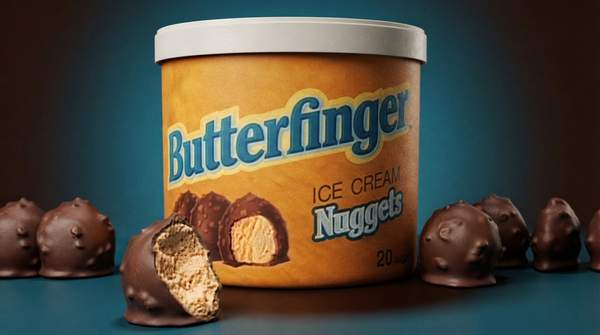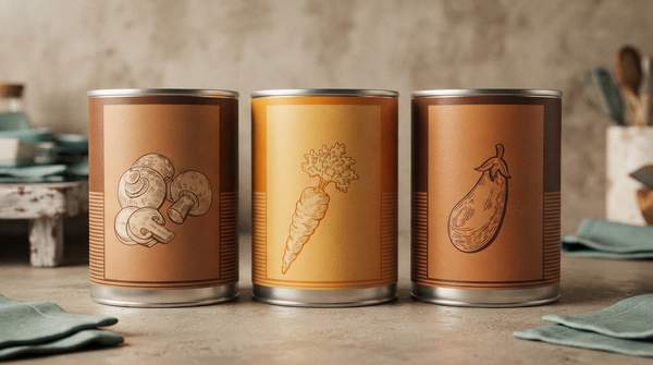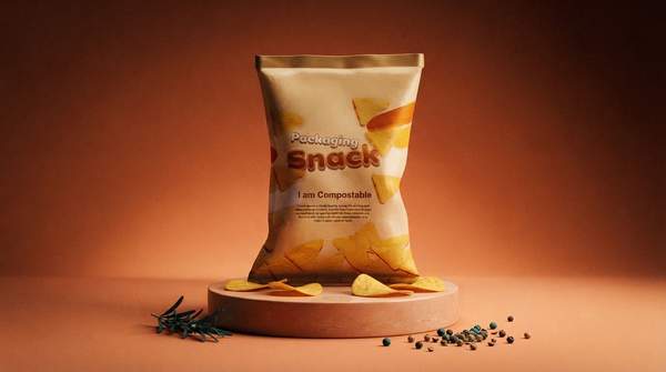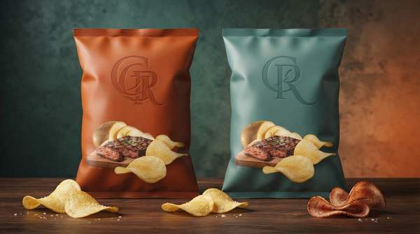
The next time you stand in the snack aisle, take a moment to notice the colors shouting at you from the shelves. Research on consumer perception suggests they are not random: packaging color systematically shapes how we judge a snack's tastiness, healthiness, and quality before we have taken a single bite. A study on snack packaging, published in the Asian Journal of Business Research, found that consumers may perceive products in green and blue packaging as healthier options, while red and yellow packaging may be seen as more delicious or appetizing. Brands know this, and they design accordingly. Here is how to read their visual language.
Warm vs. Cool: The Fundamental Divide in Food Marketing
The most useful mental model is also the simplest: split the color wheel into warm and cool. Writing in a peer-reviewed analysis of food packaging and purchase intention, researchers found that for so-called "vice foods"—products characterized by tastiness but unhealthiness—warm-colored packaging enhances consumer purchase intent. For "virtue foods," described as healthful but lacking gustatory appeal, cool packaging colors lead to higher purchase intent. The same analysis notes that perceived fluency, meaning how easily a product's look matches its expected identity, mediates this interaction between color and food type.
That review, which examined how packaging color influences consumer perceptions, emotions, and purchase intentions, reports that warm-colored packaging might closely associate with the tastiness or sweetness of food, while cool colors might relate to freshness or health attributes. In other words, a red bag promises pleasure, while a green one promises virtue—and the pairing works best when the color matches what the product actually claims to be.
There is a catch that the snack study highlights: it supports what earlier research by Mai and colleagues suggested, a common perception that "healthier products are less tasty." That perceived trade-off means the color cues can work against a product too. A health-focused snack wrapped in warm, indulgent red risks confusing the signal; an indulgent treat in clinical pale green may read as virtuous and joyless.
Decoding Specific Colors in Snack Packaging
Within the warm–cool divide, individual hues carry more specific associations. Packaging-industry writer Natalie MacVarish, writing for ICPG, describes red as associated with excitement, energy, and appetite stimulation, noting that its sense of urgency can drive impulse purchases. Gill Hyslop, writing for BakeryAndSnacks, gives the flavor: bright red packaging is "designed to incite action – think Takis, Doritos and Hot Cheetos."
Yellow packaging often conveys cheerfulness and energy, making it suitable for family-oriented snacks such as Twinkies, Minions-themed Hostess Cakes, and Lay's Classic. Green is frequently used to imply plant-based purity or clean-label health, as seen with brands like Hippeas, Nature's Bakery, and Lärabar's Organic range. Brown packaging typically signals rustic indulgence and wholegrain qualities, exemplified by products like Bobo's Oat Bars, Clif Bar, and Dave's Killer Bread. And while blue appears less often in food packaging—MacVarish notes it can be perceived as an appetite suppressant—the snack-perception study grouped it with green as a color consumers associate with healthiness.
The general associations and specific brand examples are synthesized in the reference guide below.